
Bellingcat est un groupe international indépendant de chercheurs, d’enquêteurs et de journalistes citoyens utilisant à la fois enquêtes open source et réseaux sociaux
▷ BELLINGCAT FRANÇAIS
30.06.2026 à 10:25
Burning Forests: Tools for Tracking and Reporting Wildfire Damage
Galen Reich
If you’ve seen reports of a wildfire in your region and you’re looking for open source data, NASA’s fire-tracking tool is often the first place to start. It provides a heat signature and an approximate location. But detection is only the first step in understanding what’s happened. In this guide, we explore ways to analyse […]
The post Burning Forests: Tools for Tracking and Reporting Wildfire Damage appeared first on bellingcat.
Texte intégral (5851 mots)
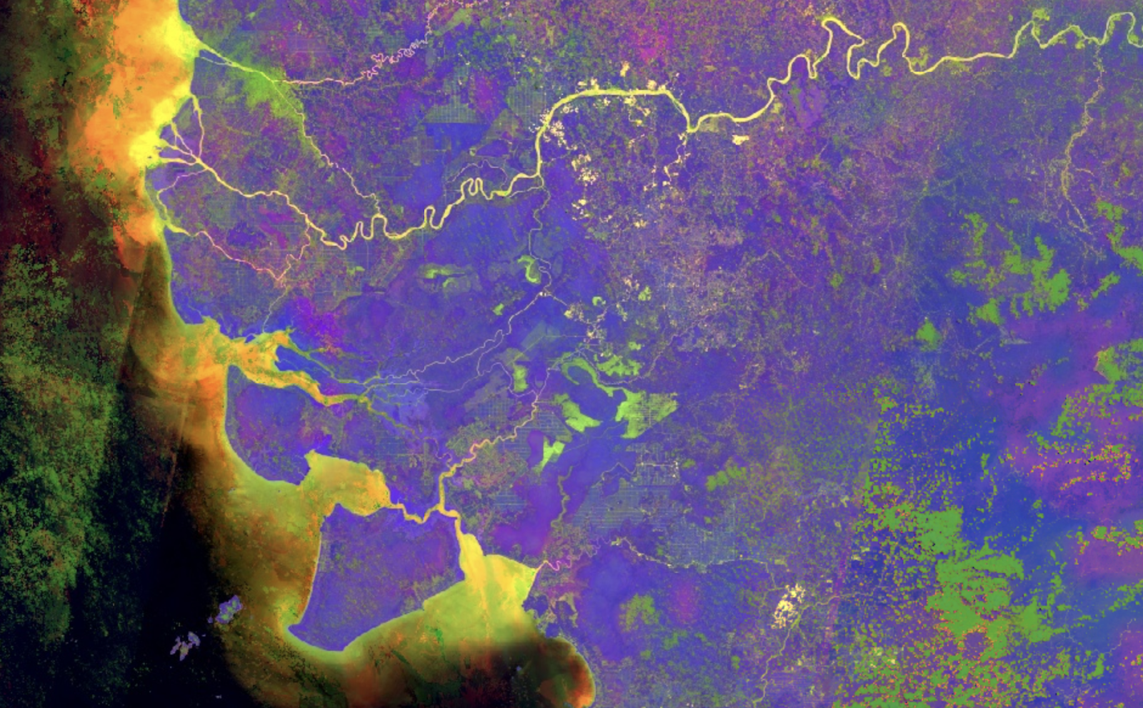
If you’ve seen reports of a wildfire in your region and you’re looking for open source data, NASA’s fire-tracking tool is often the first place to start. It provides a heat signature and an approximate location. But detection is only the first step in understanding what’s happened. In this guide, we explore ways to analyse and report on the scale and severity of wildfires, including those in protected areas where ecosystems are often most fragile. We also examine how often fires recur in the same region over multiple seasons, helping to identify patterns in fire activity as climate change reshapes fire risk around the world.
Satellite imagery from Copernicus Browser will be used to visualise the spread of the fire, and vegetation health indices to assess burn severity. The datasets will then be combined in QGIS for more in-depth analysis. At each stage, suggestions will be offered for turning the data into clear, reportable findings.
Throughout this guide, a single case study will be used: Sicily’s Zingaro Nature Reserve. In 2025, wildfires swept across the region, destroying forests, grasslands and croplands. Located on the Capo San Vito peninsula, the reserve was so severely affected that sections remain closed today.
Visualising Scorched Earth
When investigating a wildfire, it’s important to narrow down when it occurred and where it spread. The Landsat and Sentinel-2 missions are well-suited to this task, providing regular free imagery of most of the Earth’s landmass.
Below are two sets of Sentinel-2 imagery showing conditions shortly before and after a fire on July 25, 2025, near Capo San Vito, Sicily. The top two images are true-colour, similar to what would be seen from an aeroplane window. The image on the top right shows an area of scorched earth on the eastern side of the peninsula, but the exact extent of the fire is difficult to determine because the colour of the ground has changed only slightly.

Related articles by Bellingcat
Seeing More With Satellite Imagery Using Band Combinations, Ratios and Indices
The bottom two images are false-colour and highlight the difference between healthy vegetation and burned areas. Such imagery is possible because Sentinel-2 captures bands of light outside the visible range, a technique known as multispectral imaging. In these images, the near-infrared (NIR) band is coloured green, and the shortwave infrared (SWIR) band is coloured red. Healthy vegetation mainly reflects NIR light, so it appears green, while burned areas mainly reflect SWIR light, so they appear red.
These images were created with Copernicus Browser, a free browser-based tool from the European Space Agency for accessing and working with Sentinel imagery. It allows users to browse the Sentinel-2 catalogue by date and visualise different band combinations. You don’t need an account to use the browser, but signing in enables additional features.
If you’d like to try Copernicus Browser without further explanation, you can go straight to the false-colour post-fire image here.
To follow along step by step, first open Copernicus Browser. Then to visualise Sentinel-2 imagery:
- Zoom to the desired area on the map or use the search bar (San Vito Lo Capo, north-west Sicily)
- Select the date of interest (‘2025-07-27’ selected below).
- Select the layer of interest (‘True color’ by default; SWIR selected below).

By identifying the last available image before the fire and the earliest image after it in which the full burn area is visible, it’s possible to establish the location and timeline of the fire.
This allows us to report the following finding: “Satellite imagery reveals the extent of the damage caused by wildfires across the Capo San Vito peninsula on Sicily’s northern coast between July 20 and July 27, 2025.”
Extra exercise: Look up a recent fire (e.g., wildfires near Penco, Chile in January 2026), navigate to the affected location and try to visualise the burned area using Copernicus Browser.
Quantifying the Burned Area
The visibly scorched area can be measured using the Area of Interest tool (highlighted below), which allows users to draw a polygon on the map and calculate the total area in square kilometres. (Once drawn, keep the polygon in the editor, as it will be used again later.)

Reportable finding: “The wildfire that swept across Sicily’s Capo San Vito peninsula in 2025 burned more than 50 km2 of the peninsula, according to Sentinel-2 data.”
Repeatedly measuring the burned area over time allows you to follow the progression of a fire. This method was used by Bellingcat when covering the Etosha National Park wildfire in late September 2025.
Extra exercise: Replicate the analysis of the Etosha National Park fire from this Bellingcat article.
Assessing Burn Severity
Some fires only affect surface vegetation, while others scorch the ground and cause long-lasting damage. Burn severity can be measured using an index called the Normalised Burn Ratio (NBR).
How Does the Normalised Burn Ratio (NBR) Detect Burned Areas?
The spectral response of a material describes how reflective it is to different types of light. The graph below shows the difference between healthy vegetation and bare soil in terms of the amount and types of light they reflect.

By focusing on the NIR and SWIR bands, where reflectivity differs significantly between healthy vegetation and bare soil left after a burn, an index can be calculated:
NBR = (NIR – SWIR) / (NIR + SWIR)
A high NBR indicates healthy vegetation, while a low NBR indicates burned areas.
Copernicus Browser doesn’t include a default NBR layer, but it can be added via a custom script, as shown in the screenshot below:
- Select ‘Custom’ in the layer selector.
- Switch from the ‘Composite’ to the ‘Custom’ tab.
- Check ‘Load script from URL’.
- Paste this URL: https://bellingcat-scripts.ams3.cdn.digitaloceanspaces.com/NormalizedBurnRatio.js
- Load the script by clicking the green circular arrows to the right of the URL.
- Click ‘Apply’ (you may need to scroll down).
Alternatively, you can skip these steps and go straight to the custom NBR post-fire image here.

The NBR layer displays positive values in green (healthy vegetation) and negative values in purple (burned areas), making the boundary of the scorched area much clearer than before.
To calculate the change in NBR in Copernicus Browser, use the Statistical Information tool (a free account is required to access this feature).
- Within the date selector, choose a date a few weeks or months after the fire.
- Using the Area of Interest polygon, select the ‘Statistical Info chart’ icon.

- Set the maximum cloud cover to around 30% using the slider in the top right.
- Select a date range that captures the available data surrounding the fire (July 20-27 shown below).
- Identify when the fire occurred on the graph (this will be marked by a sharp drop in the NBR, as shown below).
- Hover over the points on the graph immediately before and after the fire to display the mean value.

In this example, the pre-fire image had an average NBR of 0.11 and the post-fire image had an average NBR of -0.18. The NBR decreased by 0.29, which represents a moderate burn.
| Severity Level | Change in NBR |
| Unburned | Less than 0.100 |
| Low | 0.100 – 0.269 |
| Moderate | 0.270 – 0.659 |
| High | 0.660 or greater |
Reportable finding: In late July, the fire, which scorched more than 50km2 of Sicily’s Capo San Vito peninsula, was deemed moderately severe according to the US Forest Service guidelines.
Extra exercise: Find a custom visualisation script of interest from this repository and explore what it does.
Wildfires in Conservation Areas
By focusing on protected sites such as nature reserves and national parks, we can begin to assess how wildfires affect areas of high conservation value. Controlled burns are widely used in agriculture and land management, but unchecked fires in protected areas risk eroding fragile ecosystems.
The proportion of the Zingaro Nature Reserve that was damaged by the fire can be estimated by combining the NBR image created in Copernicus Browser with a dataset from Protected Planet, a global map of protected areas that includes nature reserves.
QGIS, a program for working with geographic data, is well-suited for this type of analysis. Download and install QGIS on your computer. For help with this step, refer to the QGIS installation guide.
To download the NBR image from Copernicus Browser:
- With the NBR visualisation selected, click the ‘Download’ icon.
- Switch tabs at the top from ‘Basic’ to ‘Analytical’.
- Change the image format to ‘TIFF (32-bit float)’.
- Change the image resolution to ‘HIGH’.
- Change the coordinate system to ‘Popular Web Mercator (EPSG:3857)’.
- Toggle the ‘Clip extra bands’ switch to the off position (see image below).
- Select the ‘Custom’ layer check box (and deselect any others).
- Click ‘Download’.
- Wait. It could take several minutes for the image to be generated and downloaded.

Once the image has downloaded, rename it to NBR.tiff to make it easier to work with.
Next, open QGIS and click ‘New Project’ in the upper left.
Load the image from Copernicus Browser by dragging and dropping the downloaded file into QGIS.
Useful QGIS Terminology
CRS – The Coordinate Reference System describes how the world should be measured and projected. Two of the most common are:
EPSG:4326 – WGS 84, which uses latitude and longitude as the unit of measurement.
EPSG:3857 – WGS 84 / Pseudo-Mercator, which uses metres as the unit of measurement.
Raster – a type of data that uses pixels to represent information (such as satellite imagery)
Vector – a type of data that uses points, lines, and polygons to represent information (such as a burn area polygon).
Processing the NBR Image
Next, we categorise each pixel in the NBR image as burned or unburned.
Previous analysis in Copernicus Browser showed that the Zingaro Nature Reserve’s NBR value dropped below zero only after the fire (before image: mean NBR value on July 20, 0.11; after image: mean NBR value on July 27, -0.18).
We can use this analysis to set a threshold; anything below zero will be categorised as burned.
The QGIS Raster Calculator lets us apply our threshold to the NBR image and create a new layer.
Open the Raster Calculator by selecting ‘Raster > Raster Calculator…’ from the menu bar at the top.

The Raster Calculator lists the raster bands available in the project. In this example, there are five. These bands are set by the custom script we used in Copernicus Browser and are numbered as follows:
- Red
- Green
- Blue
- Pixel validity (not used in this example)
- NBR index
To create a new raster layer that applies our threshold on the NBR index band:
- Double-click the fifth band (ending ‘@5’) to add it to the expression box at the bottom.
- Add < 0 using your keyboard (shown above).
- Select the ‘Create on-the-fly raster instead of writing layer to disk’ checkbox.
- Click ‘OK’.
The expression NBR@5 < 0 tells QGIS to categorise NBR index values as burned if they are less than zero.
The new layer shows burned areas as white (a value of 1), and unburned areas as black (a value of 0).

Extra exercise: Download an NBR image captured before the fire. Use the Raster Calculator to create a new layer that shows burn severity.
Adding Conservation Area Data
Download the Zingaro Nature Reserve dataset from Protected Planet by selecting ‘Download > File Geodatabase’.
As before, drag and drop the downloaded file into QGIS. This time, the download is a zip file and contains many PDF files as well as the geodatabase file of interest. Scroll down to the bottom of the list and select the ‘gdbtable’ file with a polygon icon on the left side (see the blue highlighted row below), then press ‘Add Layers’.

This adds the nature reserve polygon as a layer in QGIS (and gives it an arbitrary colour). The nature reserve is almost completely contained within the white burned area, indicating it was heavily affected by the wildfire.

Quantifying the Burned Area in the Nature Reserve
To measure the proportion of the nature reserve that was burned by the wildfire, we will use the Zonal Histogram tool from the QGIS Processing Toolbox to count the number of unburned and burned pixels within the reserve polygon.
Open the toolbox with ‘Processing > Toolbox’, and a pane should open to the right. In the Processing Toolbox search field, look up ‘Zonal Histogram’ and double-click the result to open the tool.
To create a new layer:
- Set the ‘Raster layer’ to the threshold burn area layer (NBR@5 < 0)
- Set the ‘Vector layer containing zones’ to the nature reserve polygon layer (should start with ‘WDPA_’).
- Click ‘Run’
- Click ‘Close’

This will create a new layer called ‘Output zones’, which is a copy of the nature reserve polygon with pixel counts added.
Select the output layer in the lower left and click ‘Attribute Table’ in the upper right. (The attribute table is a spreadsheet-like view of the data contained in a layer.)
For the output layer, there is just one row because there is only one polygon. If the layer contained many polygons, there would be many rows.
The newly calculated counts are added to the end of the table, so scroll all the way to the right. Look for fields starting with ‘HISTO_’. Here, HISTO_0 is the count of unburned pixels (value of 0), and HISTO_1 is the count of burned pixels (value of 1).

To calculate the proportion of burned area, the number of burned pixels is divided by the total number of pixels.
Proportion = 57413 / (57413 + 2195) = 0.96318…
A value of 0.96318 means that just over 96.3% of the nature reserve burned.
Reportable finding: In late July, more than 95% of the Zingaro Nature Reserve burned in a wildfire, according to Sentinel-2 satellite imagery and Protected Planet data.
Tracking Past Wildfires
To assess the significance of an ongoing wildfire, it is important to place it in historical context. How does it compare with previous fires in the same area? Is it part of a seasonal pattern, or does it represent an unusually severe event?
With coverage dating back to 2008, the European Forest Fire Information System (EFFIS) automatically maps wildfires across Europe, North Africa, and parts of the Middle East.
Fire data can be requested directly from EFFIS using web form, with results delivered by email. For ease, you can also download Bellingcat’s archived copy of EFFIS wildfire data for Italy covering 2015–2025.
For this section, it is best to open a new QGIS project.
To view and analyse historic wildfires in the Zingaro Nature Reserve using EFFIS data:
- (Optional) Add the OpenStreetMap layer from the XYZ Tiles category by double-clicking it.
- Load the EFFIS data into QGIS. If prompted to select a coordinate transformation, click ‘OK’ to accept the default option.
- Load the Protected Planet Zingaro Nature Reserve polygon as described earlier.
- Open the Vector Intersection tool by selecting ‘Vector > Geoprocessing Tools > Intersection…’ from the menu bar at the top.

The Intersection tool creates a new layer containing only the fires that affected the Zingaro Nature Reserve. To create the new layer:
- Set the ‘Input layer’ to the EFFIS fires layer.
- Set the ‘Overlay layer’ to the Zingaro Nature Reserve polygon layer.
- Click ‘Run’.

QGIS functionality can be extended through plugins, including Data Plotly, which adds data visualisation tools. To install Data Plotly, open the Plugin Manager by selecting ‘Plugins > Manage and Install Plugins…’ from the menu bar, then:
- Search for ‘Data Plotly’ in the available list.
- Select the plugin from the search results.
- Click ‘Install Plugin’ to download and install it.

Once installed, open the Data Plotly panel with ‘View > Panels > DataPlotly’. The panel should appear on the right-hand side of the QGIS window.
To plot a graph of historic wildfire activity within the nature reserve, configure Data Plotly as follows:
- For ‘Plot type’, choose ‘Bar Plot’.
- Set the ‘Layer’ to the newly created ‘Intersection’ layer.
- In ‘X field’, type “year(initialdat)”. This expression extracts the year from the fire’s approximate start date, allowing events from the same year to be grouped together.
- In ‘Y field’ enter “$area/1000000”. This expression calculates the burned area within the nature reserve in square kilometres.
Note: EFFIS data provide initial and final dates for each fire, which are approximate because they depend on the availability of satellite imagery. These dates should be treated as bounds for when a fire occurred, rather than as the dates when it started and ended.
Next, switch to the Layout tab in Data Plotly:
- Untick ‘Show Legend’. Only do this for simple plots where a legend is not required.
- Add a title and labels for the X and Y axes.
- Finally, click ‘Create Plot’ and wait a few seconds for the chart to be generated.

The chart shows that the Zingaro Nature Reserve has experienced several significant wildfires over time. However, in 2025, the data show that the fire burned a larger area within the reserve than the major fires recorded in 2020 and 2017.

Reportable finding: The Zingaro Nature Reserve has experienced three major wildfires since 2015. Of these, the 2025 fire burned a larger area within the reserve than those recorded in 2020 and 2017.
The tools and methods in this guide can be applied to wildfires in many other regions. By combining satellite imagery with environmental and historical datasets, it’s possible to move beyond detection and begin to quantify a fire’s impact. In doing so, you can also place individual incidents in context, revealing whether they are part of a recurring pattern or an unusually severe event.
To learn more about fire detection, see Bellingcat’s guide to NASA FIRMS.
To explore QGIS further, visit the Bellingcat toolkit entry on QGIS.
Merel Zoet and Claire Press contributed to this report.
This guide contains modified Copernicus Sentinel data (2025), processed with Copernicus Browser, as well as data from the European Forest Fire Information System (EFFIS) of the European Commission Joint Research Centre.
Bellingcat is a non-profit and the ability to carry out our work is dependent on the kind support of individual donors. If you would like to support our work, you can do so here. You can also subscribe to our Patreon channel here. Subscribe to our Newsletter and follow us on Bluesky here, Instagram here, Reddit here and YouTube here.
The post Burning Forests: Tools for Tracking and Reporting Wildfire Damage appeared first on bellingcat.
30.06.2026 à 00:34
Satellite Imagery Shows Scale of Venezuela Earthquake Damage
Conflict and Human Rights Team
At least 1,719 people are reported to have died after two devastating earthquakes struck northwestern Venezuela last week. The final casualty count is expected to rise significantly. Some media outlets report resident’s growing frustration with the Venezuelan government and its recovery efforts. Sky News on June 29 reported that the United Nations Coordinator for Humanitarian […]
The post Satellite Imagery Shows Scale of Venezuela Earthquake Damage appeared first on bellingcat.
Texte intégral (1249 mots)
At least 1,719 people are reported to have died after two devastating earthquakes struck northwestern Venezuela last week.
The final casualty count is expected to rise significantly.
Some media outlets report resident’s growing frustration with the Venezuelan government and its recovery efforts.
Sky News on June 29 reported that the United Nations Coordinator for Humanitarian Affairs in Venezuela was preparing for as many as 10,000 deaths.
Social media posts, news reports and drone footage have been shared in recent days, proving vital sources for many Venezuelans (both in the country and living abroad) who are searching for information about loved ones who remain missing.
Social media pages have been set up listing many of those who are yet to be accounted for. Others have contacted Bellingcat asking if apartment blocks relatives were staying in are still standing.
Bellingcat has received satellite imagery from Planet Labs PBC that shows one the worst affected areas in the country, including collapsed buildings and apartment blocks in La Guaira.
Readers can move laterally and vertically to observe the full image in the interactive below as well as zoom in on specific areas to assess the damage. A share button on the top right will copy a shareable link to the zoomed in area.
Scroll and zoom to see damage throughout the affected Venezuelan coast. Toggle between English and Spanish. Share a link to a specific location by clicking the button on the top right. The before imagery is from Jul 30, 2025 and Dec 12, 2023. After imagery is from Jun 27, 2026. SkySat imagery via Planet Labs PBC.
The high resolution image covers a 14-mile stretch of Venezuela’s northern coast from the towns of Catia La Mar to Caraballeda, which have been among the worst impacted.
Other areas to be significantly impacted but not included in the imagery above include Caracas, Maracay, Valencia, Barquisimeto and Yaracuy.
We have compared the satellite imagery we obtained with previous images captured before the earthquake to identify which parts of this 14-mile stretch of coastline to show changes since the quakes.
Readers can toggle between the imagery captured on June 27 (five days after the Jun. 24 quakes) and a composite of reference images taken on Jul. 30, 2025 and Dec. 11, 2023 (before the quakes).
Zooming in on specific areas reveals the scale of the damage.
For example, several buildings seem to have been flattened in the below before and after images showing the Playa Grande area.


Before imagery (left) of Playa Grande is from Feb 27, 2026. Imagery from after the earthquake (right) is from Jun 26, 2026. SkySat imagery via Planet Labs PBC.
The Planet Labs imagery also confirms significant destruction in the town of Carabelleda.


Before imagery (left) of Carabelleda is from Jun. 19, 2026. Imagery from after the earthquake (right) is from Jun 27, 2026. SkySat imagery via Planet Labs PBC.
Another area, Macuto, has been significantly impacted as well.


Before imagery (left) of Macuto is from Mar 20, 2026. Imagery from after the earthquake (right) is from Jun 27, 2026. SkySat imagery via Planet Labs PBC.
Footage taken on the ground and posted to social media also displays the devastation.
A minute-long video filmed on a 500-meter section of José María España Avenue in Carabelleda shows as many as a dozen collapsed buildings, most of them high-rises. This drone footage gives an aerial look of the destruction of at least six apartment blocks in the same area.
Another video shared on social media showed a collapsed hotel in Macuto, between Carabelleda and La Guaira.
Other open source information about the damage in cities such as Caracas, Valencia and beyond can be found on this site where individuals are uploading images and videos detailing damage.
While international rescuers continue to arrive in Venezuela, the threat of aftershocks remains.
Reuters also reports that engineers fear many buildings that remain standing could be vulnerable and are requesting an audit of state housing.
Carlos Gonzales, Jake Godin and Miguel Ramalho contributed to this report.
Bellingcat is a non-profit and the ability to carry out our work is dependent on the kind support of individual donors. If you would like to support our work, you can do so here. You can also subscribe to our Patreon channel here. Subscribe to our Newsletter and follow us on Bluesky here, Instagram here, Reddit here and YouTube here.
The post Satellite Imagery Shows Scale of Venezuela Earthquake Damage appeared first on bellingcat.
27.06.2026 à 20:02
Poster Boy: Sanctioned Kinahan Cartel Lieutenant Found Playing Padel in Dubai
Financial Investigations Team

This article is the result of a collaboration with The Sunday Times. You can find their corresponding piece here. Every Friday evening, the brochure says, players can compete to win cash prizes in one of the world’s fastest-growing racquet sports. The padel club in Dubai’s west is the picture of modern wellness culture: climate-controlled courts, […]
The post Poster Boy: Sanctioned Kinahan Cartel Lieutenant Found Playing Padel in Dubai appeared first on bellingcat.
Texte intégral (4514 mots)
This article is the result of a collaboration with The Sunday Times. You can find their corresponding piece here.
Every Friday evening, the brochure says, players can compete to win cash prizes in one of the world’s fastest-growing racquet sports. The padel club in Dubai’s west is the picture of modern wellness culture: climate-controlled courts, a private sauna and ice bath, and one-on-one coaching. The promotional image shows a bearded man in mid-swing, eyes locked on the ball. He wears matching activewear and a golden tan. The poster boy for padel is a talented player who once finished runner-up at an international tournament. He has also spent the past decade living in the shadows.

Ian Thomas Dixon is a key figure in the Kinahan cartel, the Irish organised crime group that authorities say has evolved into a US$1.5 billion transnational network involved in drug trafficking, money laundering and arms smuggling. Investigators have connected the cartel to Iran’s intelligence services and the Lebanon-based militant group Hezbollah. Its feuds with rival gangs have been linked to at least 18 murders across four countries.
Dixon, 36, along with the Kinahan Organised Crime Group’s senior leadership – Christy Kinahan, 69, and his sons Daniel, 49, and Christopher Jr, 45 – was sanctioned by the US government in 2022. Authorities allege the Irishman acted as a trusted lieutenant to Daniel Kinahan, who is said to manage the cartel’s vast drug trafficking operation by helping move bulk cash across Europe, arranging payments and keeping tabs on money owed by a narco-trafficker.

Bellingcat and The Sunday Times can today reveal how Dixon’s racquet sport hobby has left behind a digital trail that led to the most recent footage of him since those sanctions were imposed – the first time he has been pictured publicly in almost a decade. This investigation also uncovers the alias Dixon has used in Dubai and exposes the first open source links to an underworld associate who was recently extradited from the Gulf state and jailed in Scotland.
It comes as cartel leader Daniel Kinahan awaits extradition to Ireland after his arrest in Dubai on foot of a warrant issued by Irish authorities. The arrest, in April, followed an extensive policing and diplomatic effort from international law enforcement.

In March, investigations by Bellingcat and The Sunday Times exposed the first photographs of Daniel Kinahan and his father in years and also revealed that the cartel’s “friend”, former UFC fighter Mounir Lazzez, was connected to US sanctions against Iran.
The latest findings give an unprecedented glimpse into the recent activity of a key cartel associate who, until now, has largely flown under the radar.
Family Ties
When cartel founder Christy Kinahan moved to Spain after his release from an Irish prison in 2001, it wasn’t long before his new home became a hub for the gang. His sons, Daniel and Christopher Jr, soon followed him to the Costa del Sol – as did their younger cousin, Dublin native Ian Dixon.
From the late 2000s onward, Dixon worked for businesses linked to the crime family in the south of Spain. One of these was The Auld Dubliner, a pub in Estepona that reportedly served as a base of operations for the cartel. In 2010, the pub was raided and temporarily closed by authorities as part of Operation Shovel, a years-long multi-national police investigation into the cartel’s drugs and arms-trafficking activities.

Dixon would also work as a trainer at MGM Marbella, the boxing gym co-founded by Daniel Kinahan that would go on to represent some of the biggest pro boxers in the world. The company, which was renamed MTK Global, shut down after the US sanctions on the Kinahans were imposed in April 2022.

In 2016, Dixon was arrested by Spanish police investigating the murder of Irish criminal Gary Hutch. The previous year, Hutch had been gunned down while out for a morning jog in a gated community on the Costa del Sol.
Dixon was released without charge, and another Kinahan cartel associate was later sentenced to 22 years for his role in the murder. The killing sparked a feud between the Kinahans and the rival Irish Hutch gang that resulted in at least 18 deaths.
Dixon and other key Kinahan members fled to Dubai in the wake of the deadly feud.
Ian Dixon has no known convictions. But his alleged role in the Kinahan Organised Crime Group was laid bare when the US sanctioned him. Authorities said Dixon managed finances and moved bulk currency for Daniel Kinahan and also kept tabs on the debt owed by a narco-trafficker.
The sanctions notice also said Dixon controlled Hoopoe Sports LLC, a Dubai firm that listed a number of pro boxers among its clients and reportedly received more than $4 million for bouts involving former heavyweight champion Tyson Fury. Boxing promoter Bob Arum told Yahoo Sports the money was for consulting fees owed to Daniel Kinahan.

Dixon lived in an exclusive gated community in Dubai, according to the 2022 sanctions notice. Online listings show that properties like his Spanish-inspired villa are worth up to $2.7 million.
Passion for Padel
Padel is an increasingly popular racquet sport from Mexico best described as a combination of tennis and squash. According to the sport’s governing body, it has more than 17.5 million weekly players across 150 countries and the UAE, where Dixon lives, has the second-highest number of padel courts in Asia. It was on these courts in late 2024 that Dixon played in the master final of the Asia Pacific Padel Tour (APPT).
APPT rankings show Dixon registered for the tournament under the name “Ian Thomas”. Like his cartel leader relative Christy Kinahan, who used his first and middle names as an alias on his Google review profile, Dixon had dropped his surname.
Finding a Fugitive – How we Located Dixon
Bellingcat found the padel club promotion showing Ian Dixon after running images of the cartel associate through a publicly available facial recognition search engine. Among the results was a link to a graphic designer’s online portfolio, which included the advertisement for the padel competition. The original photo had been posted on the sports club’s Instagram page in late 2023, with the caption: “Elevating fun, one swing at a time!” Dixon was not named.

We searched for additional open source evidence and located online profiles for a 36-year-old Irish padel player named “Ian Thomas” who had taken part in a number of matches in Dubai in recent years. One profile shows he played 16 ranked matches between September 2024 and April 2026 – the most recent being the week after Daniel Kinahan’s arrest. But the accounts did not include profile pictures.

Bellingcat searched for footage showing the padel events and venues listed on the profiles. It returned multiple social media posts and live-streams clearly showing Ian Dixon at the same events where “Ian Thomas” was registered as playing. Dixon can also be heard speaking with a Dublin accent and at one point is seen with a close relative of Daniel Kinahan.
Dixon and his doubles partner played four games over the December 13-15 weekend, eventually placing second after losing in the final. The Irish cartel associate is captured on film after the match receiving a silver medal and commemorative racquet.
The Asia Pacific Padel Tour was held a month after senior Kinahan cartel figure Sean McGovern was arrested in Dubai on foot of an Interpol red notice. McGovern was extradited to Ireland last year and earlier this month jailed for 24 years for directing the activities of a criminal organisation in relation to murder and attempted murder.
The tournament was live-streamed to YouTube via webcams set up on two courts. Dixon was captured throughout the three-day event, both playing on the court and mingling with others in the background. The hour-long male amateur final, which Dixon lost, is viewable in its entirety.
Dixon also posed for photos during the tournament, but it appears he did have some reticence about appearing on social media. In two images from a different padel event hosted at the same venue a few months later, Dixon’s face had been covered. However, a third photo was not edited, confirming that it was Ian Dixon.
Kingpin in the Crowd
Among the people Dixon was seen with at padel events in Dubai was Stephen Jamieson, a Scottish criminal who was recently jailed for his role in a multimillion-dollar drug trafficking operation.
Dixon greeted Jamieson with a fist pump during the Dubai APPT tournament in December 2024 on the day the Irishman played in the amateur final.

Dixon was also pictured with Jamieson at a family day padel event just weeks before the Scottish criminal’s arrest. (Bellingcat is not publishing details of that event to protect the identity of family members.)
Jamieson, who has multiple convictions, was extradited from Dubai last year and is serving a six-year prison sentence in Scotland on organised crime and drug charges. The case against him was built around intercepted messages he had sent via the defunct encrypted communication network EncroChat – a network the Kinahans have also used – to direct drug shipments.
The Sunday Times reports today on the Kinahan cartel’s deeply entrenched links to organised crime in the UK, where it is known to control much of the illicit drug market. It said the footage showing that Dixon and Jamieson know each other could indicate an underworld connection, since cartel cadres do not associate with rival operations.

Three of the seven alleged key Kinahan cartel figures have been arrested since the US sanctions were imposed. Johnny Morrissey, arrested in Spain in 2022, was later bailed and subject to a travel ban. Sean McGovern was jailed earlier this month and Daniel Kinahan awaits extradition to Ireland after his recent arrest in Dubai. Garda Commissioner Justin Kelly, of Ireland’s police force, recently said the investigation into the Kinahan cartel was ongoing and that authorities were continuing to focus on the other members of the gang.
Ian Dixon did not respond to questions from Bellingcat.
Connor Plunkett, Peter Barth, Beau Donelly and John Mooney contributed to this article.
Bellingcat is a non-profit and the ability to carry out our work is dependent on the kind support of individual donors. If you would like to support our work, you can do so here. You can also subscribe to our Patreon channel here. Subscribe to our Newsletter and follow us on Bluesky here, Instagram here, Reddit here and YouTube here.
The post Poster Boy: Sanctioned Kinahan Cartel Lieutenant Found Playing Padel in Dubai appeared first on bellingcat.
- GÉNÉRALISTES
- Le Canard Enchaîné
- La Croix
- Le Figaro
- France 24
- France-Culture
- FTVI
- HuffPost
- L'Humanité
- LCP / Senat
- Le Media
- La Tribune
- Time France
- EUROPE ‧ RUSSIE
- Courrier Europe Ctrale
- Desk-Russie
- Euractiv
- Euronews
- Toute l'Europe
- Afrique ‧ Asie ‧ Proche-Orient
- Haaretz
- Info Asie
- Inkyfada
- Jeune Afrique
- Kurdistan au féminin
- L'Orient - Le Jour
- Orient XXI
- Rojava I.C
- INTERNATIONAL
- Courrier International
- Equaltimes
- Global Voices
- Infomigrants
- I.R.I.S
- The New-York Times
- OSINT ‧ INVESTIGATION
- OFF Investigation
- OpenFacto°
- Bellingcat
- Disclose
- G.I.J
- I.C.I.J
- OPINION
- Au Poste
- Cause Commune
- CrimethInc.
- Hors-Serie
- L'Insoumission
- Là-bas si j'y suis
- Les Jours
- LVSL
- Politis
- Quartier Général
- Rapports de force
- Reflets
- Reseau Bastille
- StreetPress
- OBSERVATOIRES
- Armements
- Acrimed
- Conspirationnisme
- Culture
- Curation IA
- Extrême-droite
- Human Rights Watch
- Inégalités
- Justice fiscale
- Liberté de création
- Multinationales
- Situationnisme
- Sondages
- Street-Médics
- Routes de la Soie
- Wokisme